Oreo's mark
Tasty for sure, but what does the logo of the world's largest bakery represent?
You might think the ellipse in the Oreo emblem and on other Nabisco products represents a baker's oven peel with a four-handed handle. But it doesn't.
Neither is it the outline of an extra-terrestrial 1950's flying saucer with a TV antenna on top.
To find out, we must go much further back than Jeff Tracey of Thunderbirds and Dan Dare of Eagle – all the way back to the early medieval period.
At that time, some artisans placed a mark or seal on their work to confirm authenticity. It was not so common for European painters to mark their work until the spread of the Humanist philosophy of the Renaissance, and when they did, it was with their name rather than a logo. However, it was customary for monastic scribes to mark the completion of a manuscript with a cross – as a sort of Amen.
These sacred books were assembled by binding 'signatures', each typically having eight leaves. To ensure the signatures were bound in the correct order, a calligraphic decoration, called a 'catchword', was drawn on the lower-right corner of each signature's final leaf. This would correspond with a similar decoration on the top-left corner of the first leaf of the next signature. To mark the end of the book, the final catchword would have a more distinctive flourish. Eventually, the more useful system of page numbering replaced catchwords, but the final catchword remained.
Paper makers, illuminators and bookbinders adopted the same practice to sign off their completed work and some of these signs became their trademarks. Examples seen today include that of the American type designer Frederic W Goudy (1865–1947), who established the Village Letter Foundry on the Hudson River; of the German paper maker Zerkall; and of the Italian Cartiera Magnani.
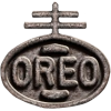
Various styles of cross appear in these logos and a 13th century monk, Cassidorius, is recorded by the reformist Roycroft movement to have used a mark similar to the logo shown on the left. The Roycroftsmen adopted the symbol as their own.
In Venice, the European capital of printing, the Society of Printers used the same mark in 1481. Much later, in 1900, this symbol inspired Adolphus Green, the National Biscuit Company's first chairman, to include it in the new company logo.
The cross is modelled on the Cross of Lorraine and the circle, with an equatorial band, represents the world. The cross and orb is a symbol representing the triumph of humankind's sin by the sacrifice of Jesus on the cross.
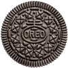
With the exception of certain countries and regions, Nabisco's Oreo biscuits are branded with the same logo.
Nabisco, as it became officially named in 1971, is now part of the Philip Morris conglomerate, who are diversifying from their traditional product of tobacco into products less likely to result in compensation claims for sickness and death. (Litigation is currently not such an issue in countries with a lower GNI, where cigarette smoking is increasing.)
Considering who the ultimate owners of the Oreo logo are, it's ironic that the original symbol represented eternal life.
Samuel and Thomas Roycroft were 17th century printers in London and the name was chosen by Elbert Hubbard, founder of the movement and author of the 1910 political booklet Jesus Was An Anarchist. "Roycroft" is a composite abbreviation of "royal craft", relating to the guild members who were sufficiently skilled to produce books worthy of presenting to the king.
See the Meaning of the Cross


